
Colours are FRIENDS with their neighbours and LOVERS of their opposites.
Using colours effectively can transform a painting from mediocre to impactful.
Colour is relative and strongly influenced by its surroundings, so it is a useful skill to learn which colours interact effectively with one another.
There are age-old recipes that just WORK!
Depending on where you are in your colour theory journey, there are different activities you should do to further your understanding of colour relationships.
Before we jump into the activities, here is a quick run-through of colour basics:
Primary Colours: Red, Blue, and Yellow
Primary Colours cannot be created by mixing other colours.
Secondary Colours: Orange, Green, and Purple
These are made by combining primary colours.
Colours that are opposite to each other on the colour wheel are called complementary colours.
As opposites on the colour wheel, Primary colours are "in love" with the Secondary colours!
They complement one another and create harmony through their opposition.

We now have six colour groups which form the general basis of our colour wheel.
Each colour has a neighbour, and each has an opposite.
From the wheel to the right, you will see that:
Red
Neighbours with Orange and Purple
Opposite of Green.
Yellow
Neighbours with Orange and Green
Opposite of Purple
Blue
Neighbours with Green and Purple
Opposite of Orange
On using complementary colours:
Due to the vivid contrast between the colours, two complementary colours will activate each other on a canvas.
By using an object’s colour complement in its shading, the object will be highlighted as its colour is pushed to the limit ( eg, when painting a red apple, use green in the shadow.)
Choose one of the following to jump to the right activity for you:
At any stage in your practice, these activities can be beneficial for colour experimentation and to brush up on your colour harmonisation skills.
Starting with the Basics
Now that we know the theory of complementary colours, let’s start experimenting with them.
Creating a colour chart is the easiest way to learn about what your colours can do and how they interact with one another. Once you’ve created a chart, it also becomes far easier to paint with these colour combinations, as you can reference the chart for the colour you’re looking for, and identify what your darkest, dullest mixes are, and your lightest and brightest.
A sometimes tedious activity can save you a lot of fiddling and ambiguity in the long run. The chart will give you an overview of what “song” your colours will sing when used together in a painting.
Let’s get mixing.
Take 2 complementary colours and create a colour chart with them.
Some good combinations to start with are:
Orange + Blue + White
Cadmium Orange + Cerulean Blue
Burnt Sienna + Ultramarine Blue
Purple + Yellow + White
Cadmium Yellow + Deep Purple
Yellow Ochre + Magenta
Red + Green + White
Cadmium Red + Sap Green
Viridian Green + Alizarin Red)
The first row should have NO white mixed, to find what the darkest colours are that can be created with your 2 complementaries.
The edges are the unmixed colours with white, pulled from its darkest to lightest.

Once your chart is created and you’ve mapped out all the notes of your song, I want you to create a painting of a cube casting a shadow, based on the image below.
The aim of this activity is to understand the tonal value of colour.
Tonal value is how light or dark a colour is in relation to its surroundings. The tonal relationship of colours in a composition pulls elements forward and backward and determines its depth and impact.
I talk in more detail about this in my ‘Rivers of Light and Shadow’ blog.
For now, experiment with colour combinations to see how the tone pulls the cube and its shadows around the composition.

Magenta + Yellow Ochre
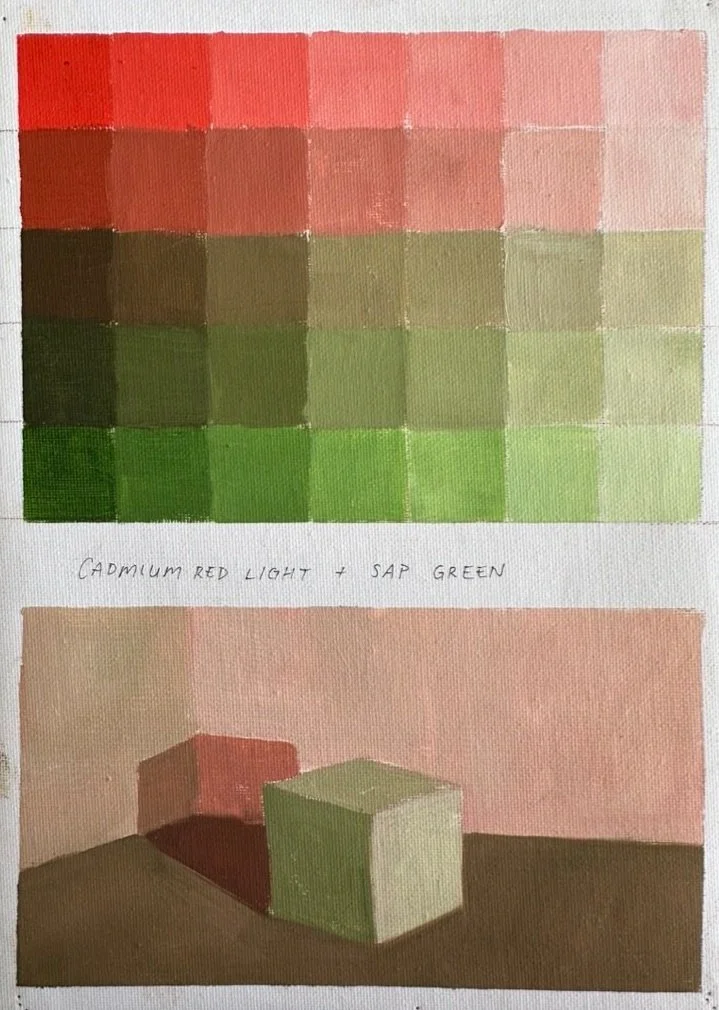
Cadmium Red Light + Sap Green
Once you’ve painted your cube/s, take a picture and turn the image black and white. Does it still make sense with the colours grey-scaled?


Can you see how the cubes above, when turned greyscale, still make sense?
And now below an example of when the wrong tones are chosen.

See how the shadow disappears here?
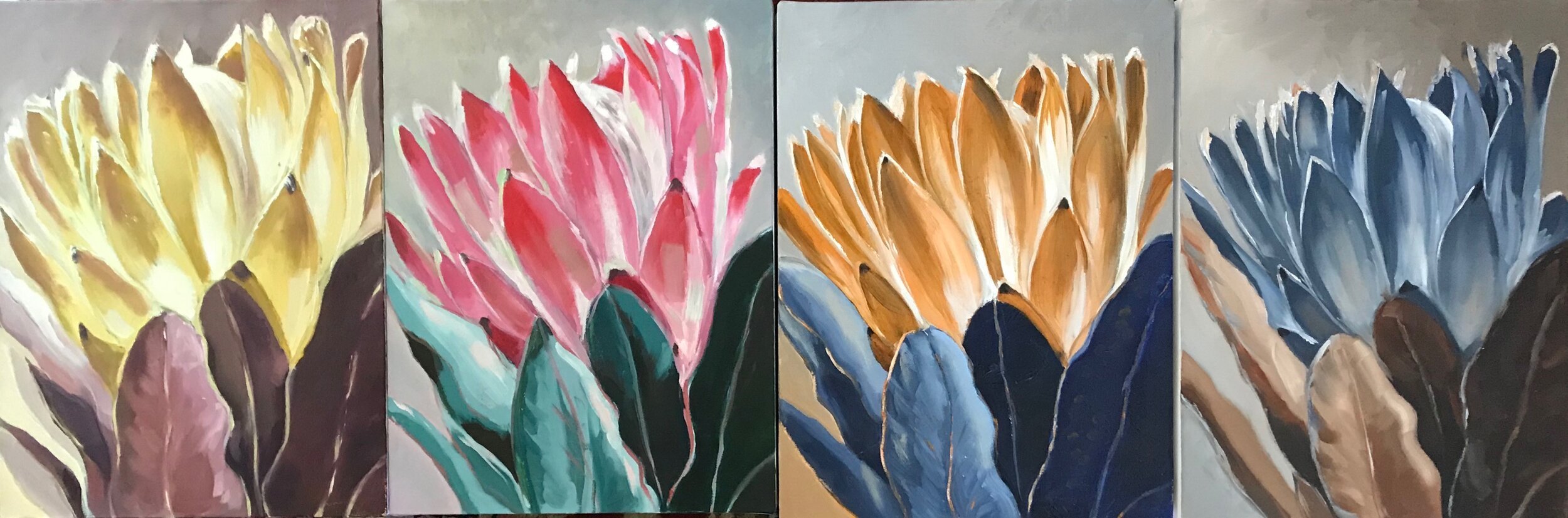
Once your cube/s is painted and you’ve tested the tonal values by turning it black and white, it’s time to use those colours to paint an inorganic shape, like a fruit or vegetable. My favourite is a pear… of course!
PLAN A THEME AND MAKE FOUR SMALL PAINTINGS USING ONLY
burnt sienna + ultramarine blue+ white
orange + any blue +white (eg. cadmium orange + cerulean blue )
purple + yellow +white ( eg. cadmium yellow+ deep purple) or ( yellow ochre + magenta)
red + green+ white (eg. cadmium red + sap green) or (viridian green + alizarin red)


These are lovely examples by students, Fiona, Suzanne, JP, and Alice.
Start by mixing the darkest dark you can with what’s available, and then adjust all the tonal values in the painting accordingly. If you’re tempted to sneak in a black, don’t, it will scream like a false note in a perfect choir!
This exercise aims to help you think in terms of
‘WARM’ VS ‘COOL’
‘LIGHT’ VS ‘DARK’
‘SATURATED COLOUR’ VS ‘ MUTED COLOUR’.

These lovely examples done by former student, Gerrie Knipe, and show how effectively complementary colours work together: each panting was only painted with the different complementary pairs and white.
Colour Schemes
-Using complementary colours side by side is a dynamic way of creating a focus point
-Using neighbor colours (Analogous) will ensure harmony in your work
- When mixing complementary colours, a wide range of greys – and also developing from this: browns – can be created. Mix in white to create a neutral beige.


Here are examples from some of my students, Elmarie, Tersia, Rina, Ann, and Andy. It is important to note that complementary colours stay effective even when you are using different shades of primary /secondary colours.
The first column depicts shades of purple and yellow, the second column red and green, then blue and orange, and the last column is an added exercise in ‘Old Master Winning Recipe’ of Ultramarine Blue and Burnt Sienna (which is an earthy complementary mix of blue and orange! That’s why they look so similar on this chart)
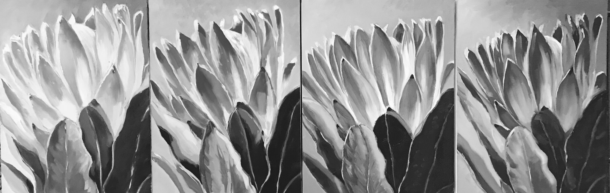
These Proteas painted by Natalie are a good example to show how colour has tonal value and if if you use them correctly you’ll see it easily when you convert your photo on your phone to monochrome. This is also a good tool to check if you’re still judging your colour correctly.
THERE IS SO MUCH TO LEARN FROM THIS EXERCISE!
Try it, and if you do, send images. I would love to see what you’ve done!